Elavon
Improving Trust in Payment Forms
Converge is a web payment point of sale application that is used by small to medium sized businesses for B2C and B2B transactions. Converge also comes bundled with other solutions such as a hosted payments page which is a securely hosted checkout page for merchants who don’t want to worry about compliance rules.
As a designer, I helped deliver an out-of-the-box hosted payment solution and an editor to provide customers a tested and customizable solution.

Discovering
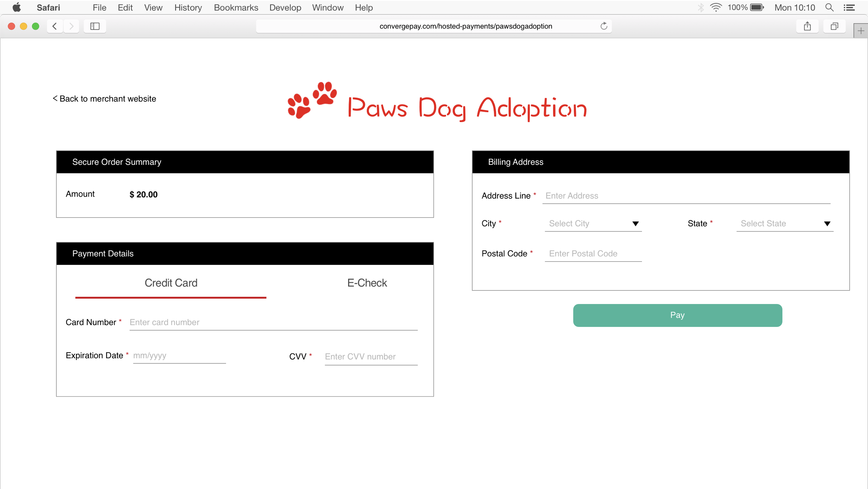
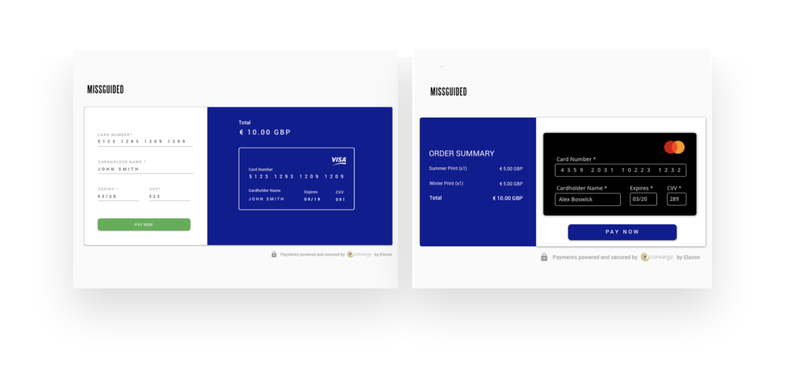
Elavon's Sales team reported that customers were not happy with the then hosted payment solution. Direct feedback from customers claimed te page "looked like a phishing attempt" as it lacked a professional look.
This caused cardholders to abandon transactions on reaching the hosted payment page.
Defining
This helped me frame a question to help answer with user research:
"When I’m building something, I want to quickly and easily find and fix component validation issues"
Solutioning
Competitor Analysis
I started by looking at some of the top payment solution providers such as Stripe, Square and Braintree.
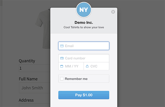
Stripe's embeddable modal payment form included a header where a merchant could add their company logo.
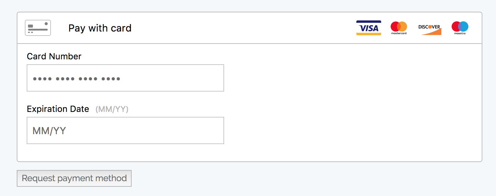
BrainTree's ready made payment form required more developer knowledge to brand it but provided information such as accepted card types.
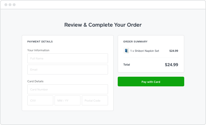
Square's full page payment form solution was ready to use, easy to read, clean and modern.
Explorations
When intitially exploring, I did lay a lot of importance to the the visual goal of making the payment form look more modern. However, the more I looked at competitors I realized I needed a control to measure trust factors in the design. So for the final design, I decided to keep it a simple form assuming shipping and shipping information was already captured on the merchant website before the payment form.
Callouts
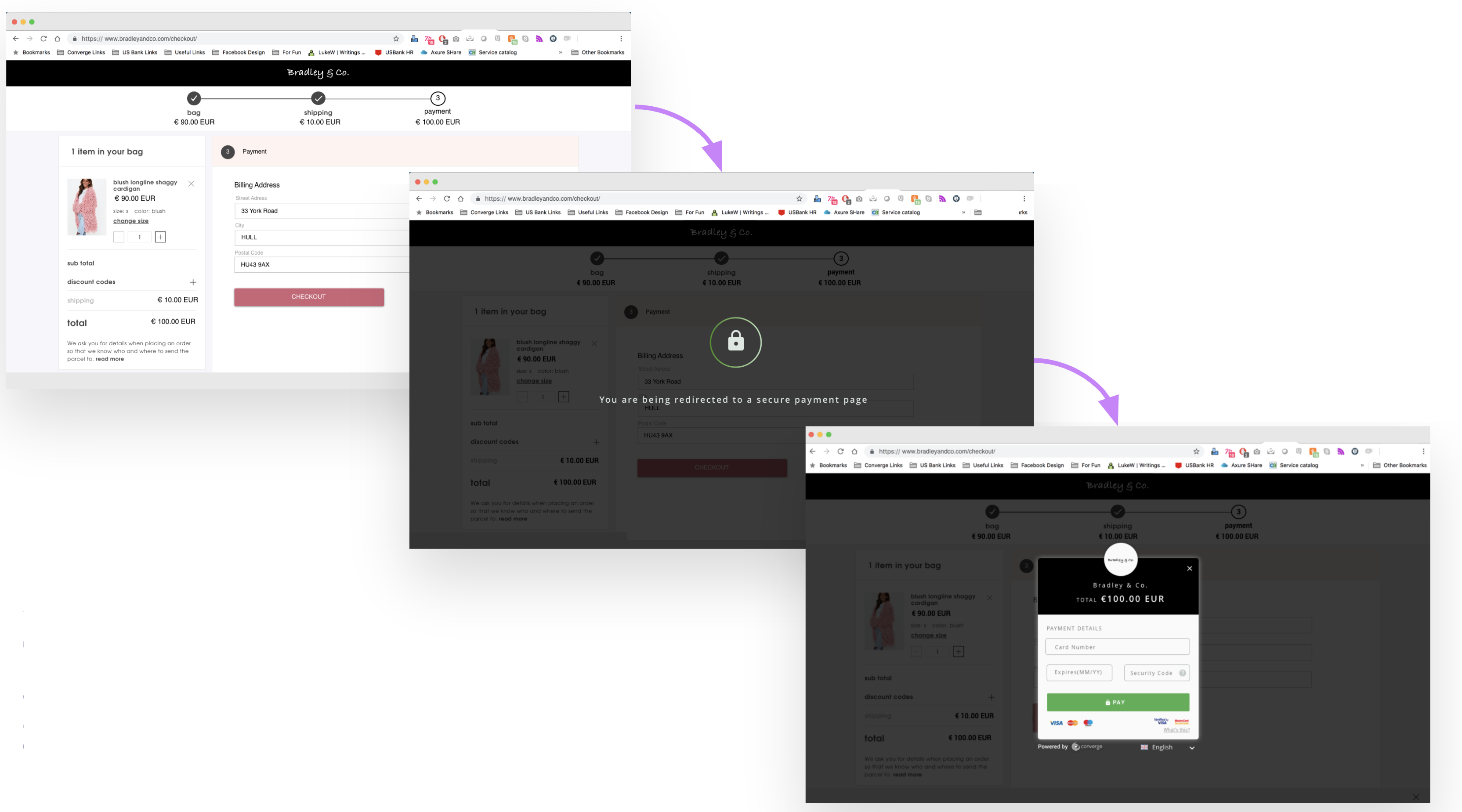
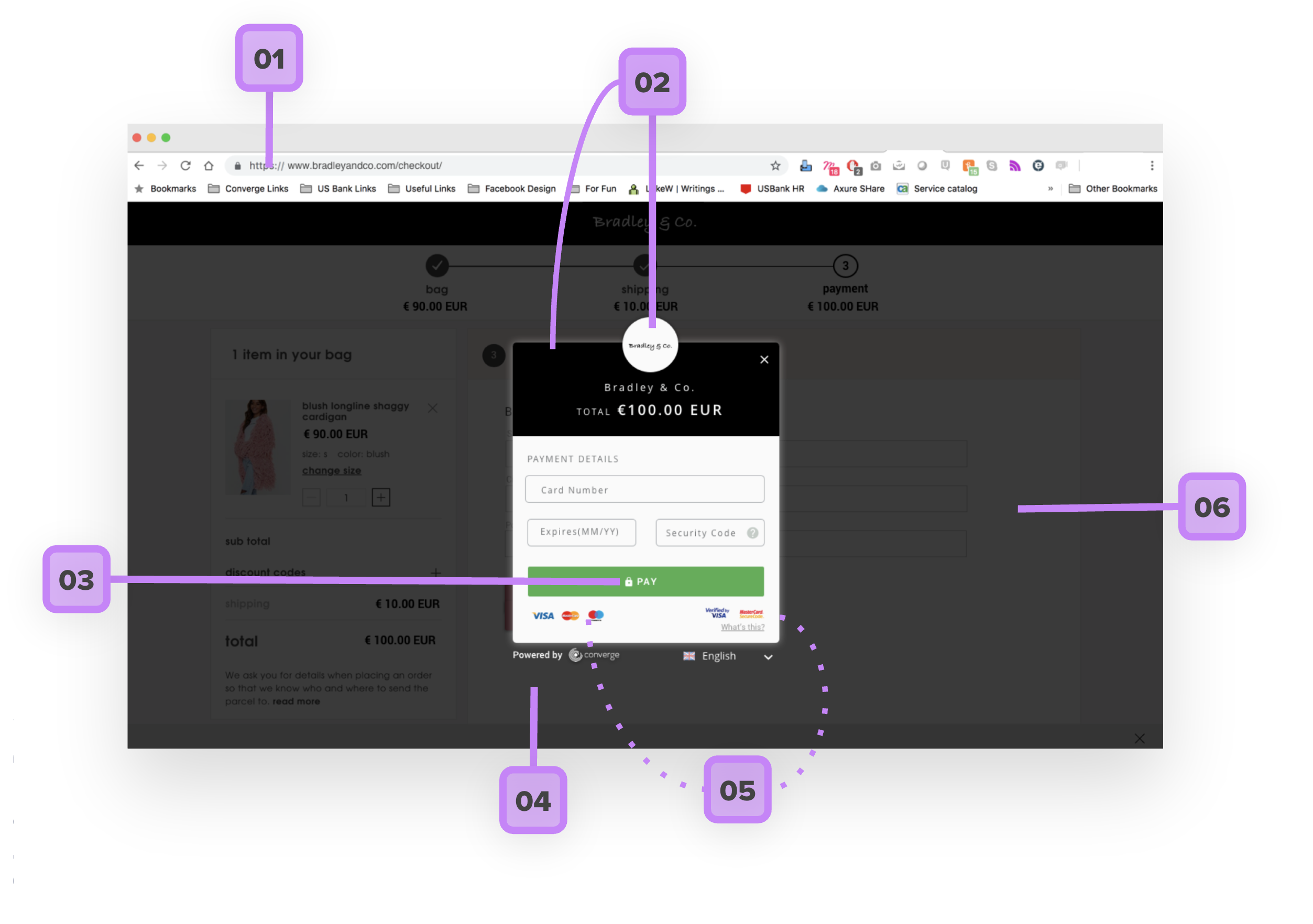
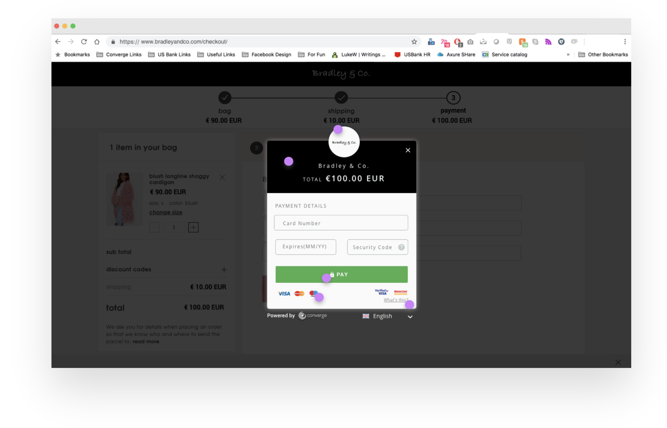
- Domain masking to reflect merchant website to make cardholders feel like the payment form is part of the merchant website experience
- Ability to add logo, business name and brand colors to the payment form.
- Lock icon in the button and lock icon in the redirect screen
- "Powered by Converge" for transparency
- Transparency in card types accepted and 3D secure support by merchant by displaying appropriate logos.
- Modal to further enhance the feeling of one experience as part of the merchant website.
User Testing
To mesure success with this new solution, we decided to upload our design flow to UserTesting.com and asked users the following questions:
Would you complete this payment? Why?
Do you think this is a secure form? Why?
Findings
~ 50% of the customers responded saying they would complete this payment. Customers claimed the following helped improve their trust in the payment form:
- symbols of lock
- using words like "secure"
- wording of phrases like "Powered by"
- logos of card types
Testers also mentioned viewing the merchant website in the background made them feel like their payment was going to the merchant.
However, on reading "Powered by Converge" they were thrown off as they didn't understand what Converge as an entity was. This reduced tester's confidence and they responded by saying they wouldn't complete the payment.
Updates based on User Testing
A lot of the design decisions were validated, but of the things that weren't, we noticed they directly caused transaction abandonment. So updates to the designs included
- Clearly calling out the purpose of this form with a header that read "Payment to {merchant_name}"
- Updating the phrase below the form from "Powered by Converge" to "Powered by Converge Payments"
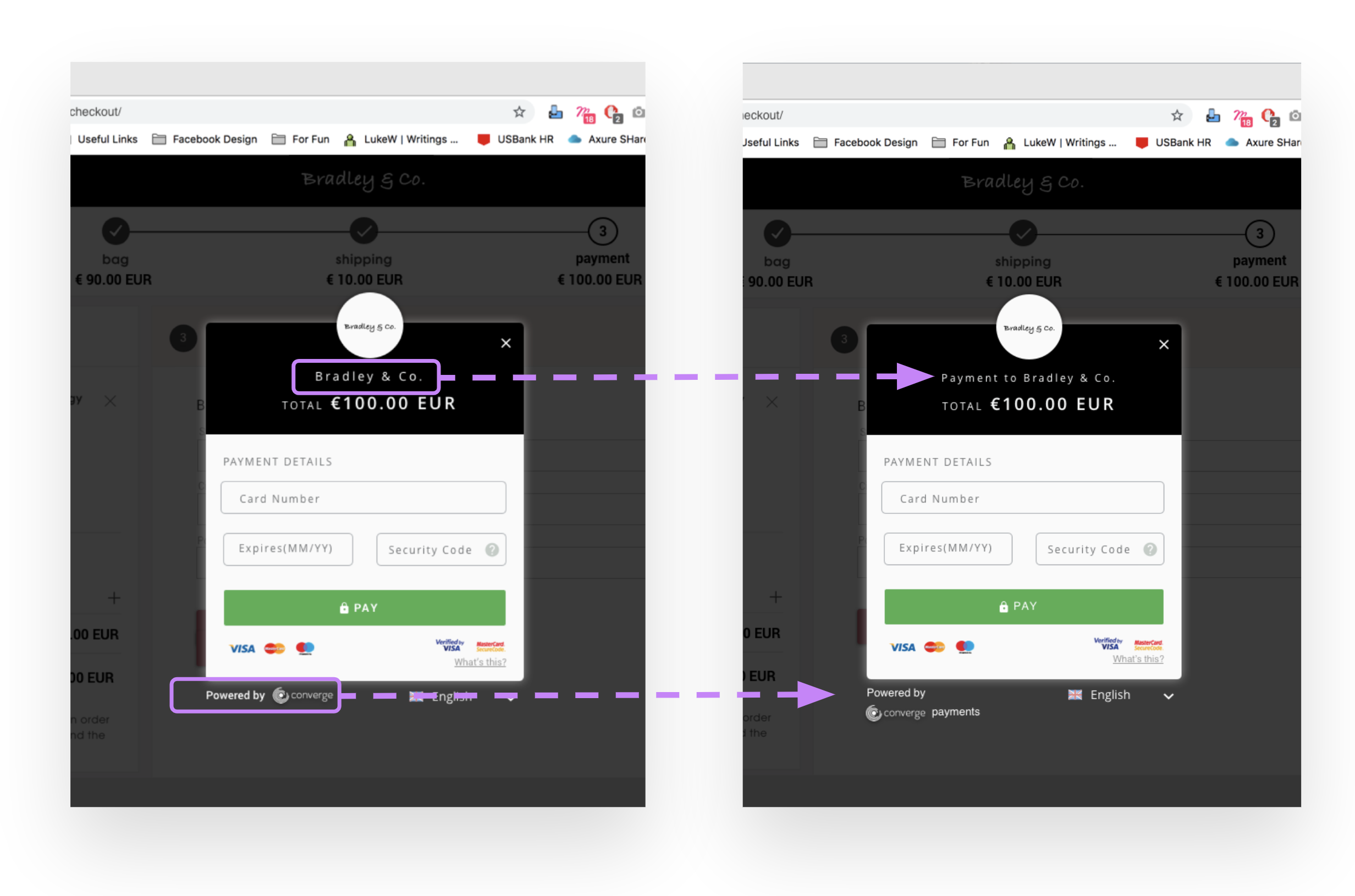
On re-testing the updated designs resulted in ~90% completing of the payment.
Concluding Thoughts
Initially the team did not want to be transparent about using Converge branding on the hosted payment page and desired a clean solution with minimal logo use. From this experiment, I learnt that transparency is always good to the assure trust to a cardholder and that some clutter is good clutter, especially in the world of fintech.
