Salesforce Builders
Builder SLDS Validation Patterns
A Salesforce Builder can be used to build applications and content in Salesforce such as flows, emails, websites and in-app guidances. Builders are part of multiple Salesforce cloud solutions.
As a designer, I helped craft patterns that allows any builder user to be informed about issues with building component blocks and also help fix these issues.
[link to Salesforce Lightning Design System: Validation Builder Pattern]

Discovering

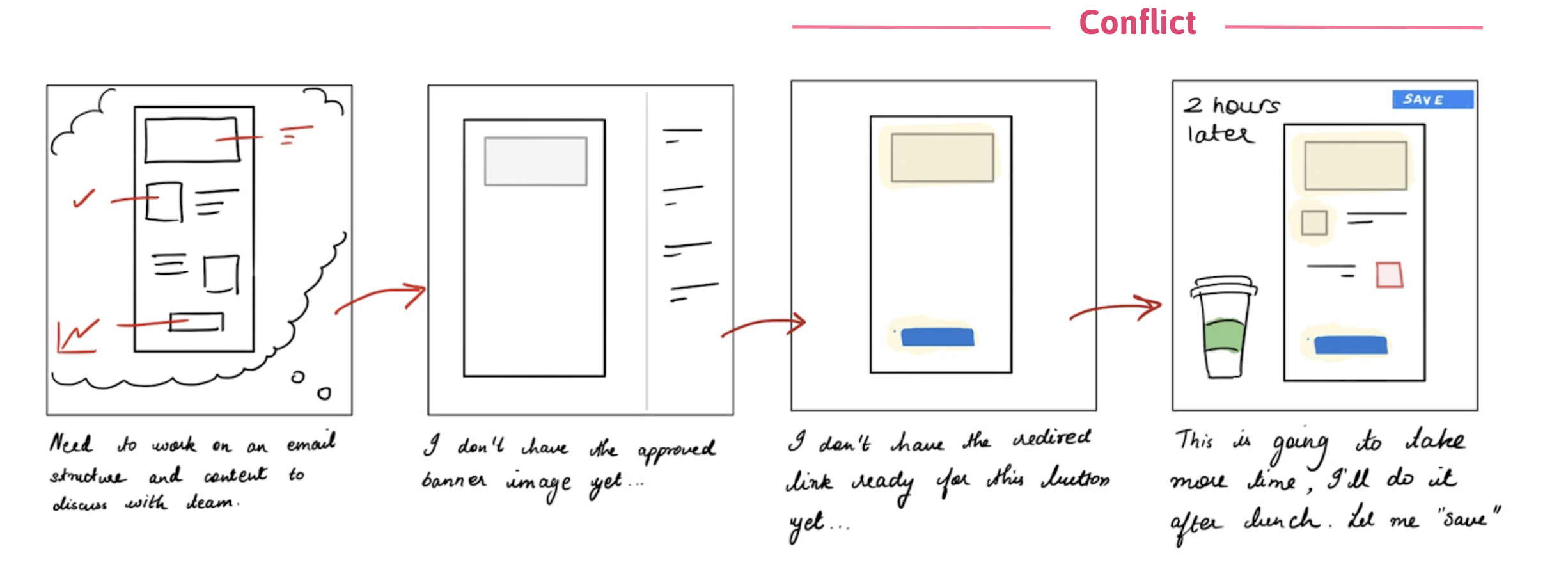
The current invalid component state took away from the creation process by blocking the component view on the canvas completely . This project was also part of a consistency effort for builders across Salesforce and part of the problem was to also keep up with emerging patterns such as tabs in panels and nested components as well as working with different kinds of components for the various builders.
Lastly, I noticed that competitors allowed users to save their progress instead of blocking them to do so with invalid components.
Defining
This helped me frame a question to help answer with user research:
"When I’m building something, I want to quickly and easily find and fix component validation issues"
Solutioning
Design Pillars
I worked with 3 guiding design pillars as I explored solutions – an elegant canvas solution, a pattern that improved discoverability of issues and a solution that was appropriately informative as well as actionable.
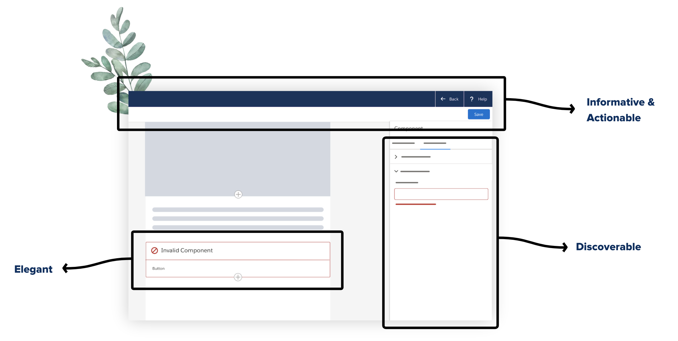
Elegant
Explorations
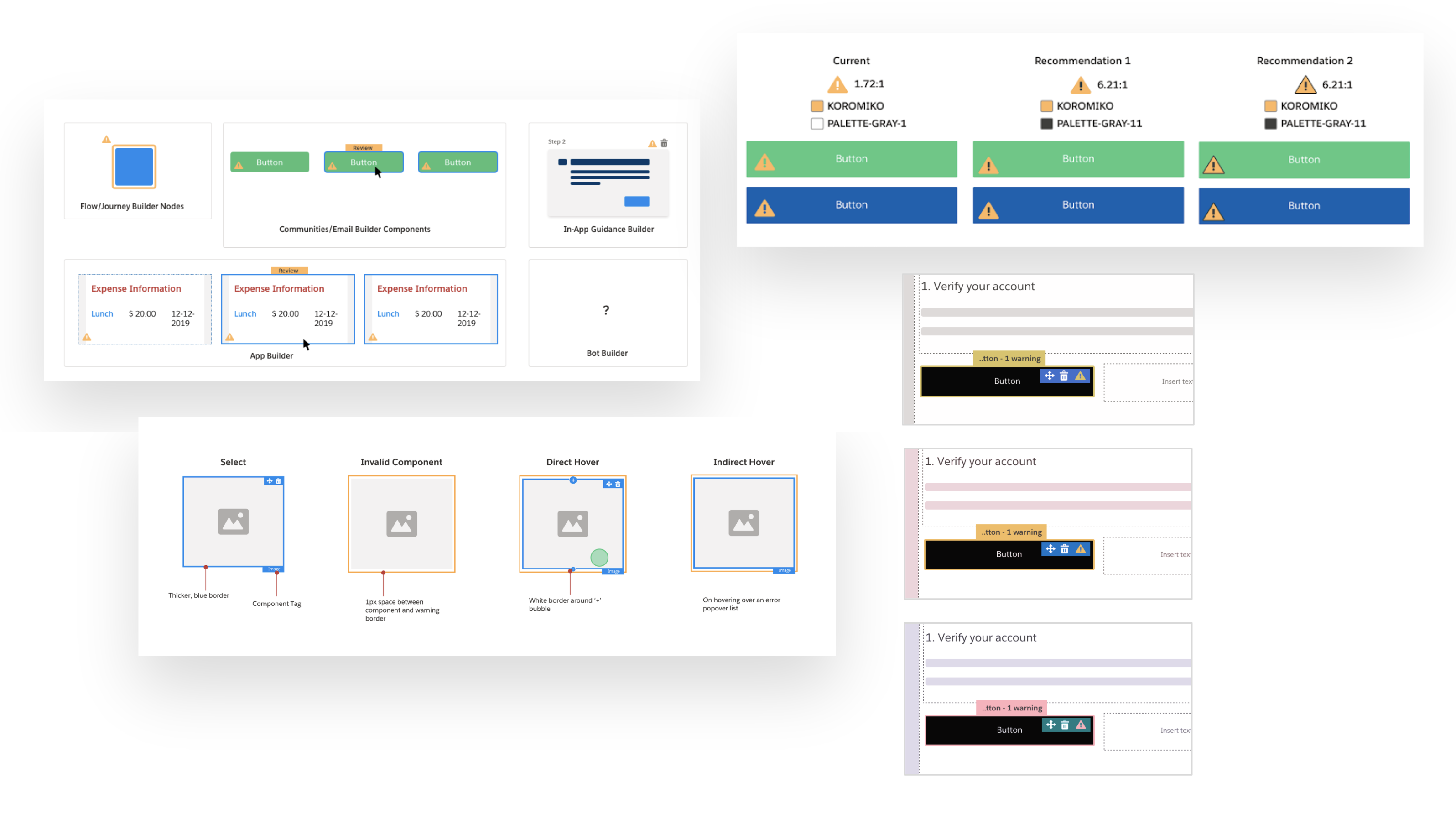
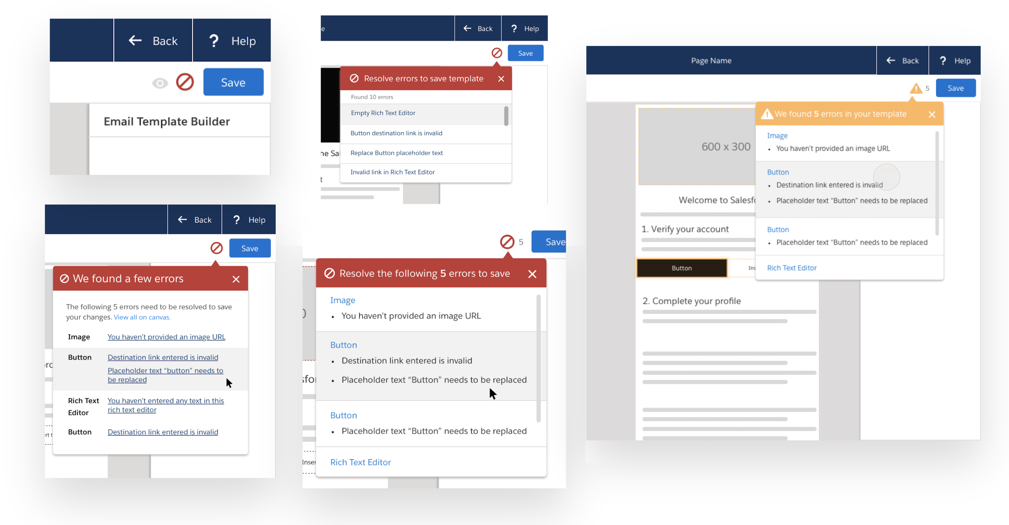
As I explored various solutions, I explored them from the perspective of components with respect to different builders. I also took the most common component type (the button) and explored ways in using icons to convey invalid component. For each, I was testing it for contrast ratios, simulating it for different visual impairments followed by a lot of UX reviews with other builder designers and engineers.
Error & Warning States
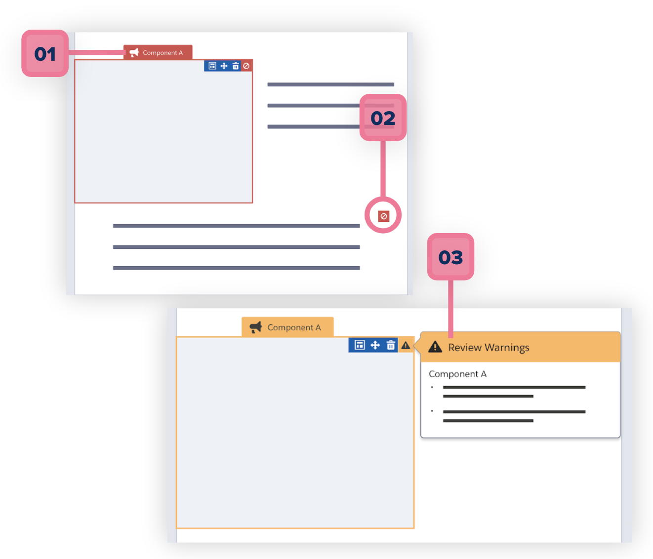
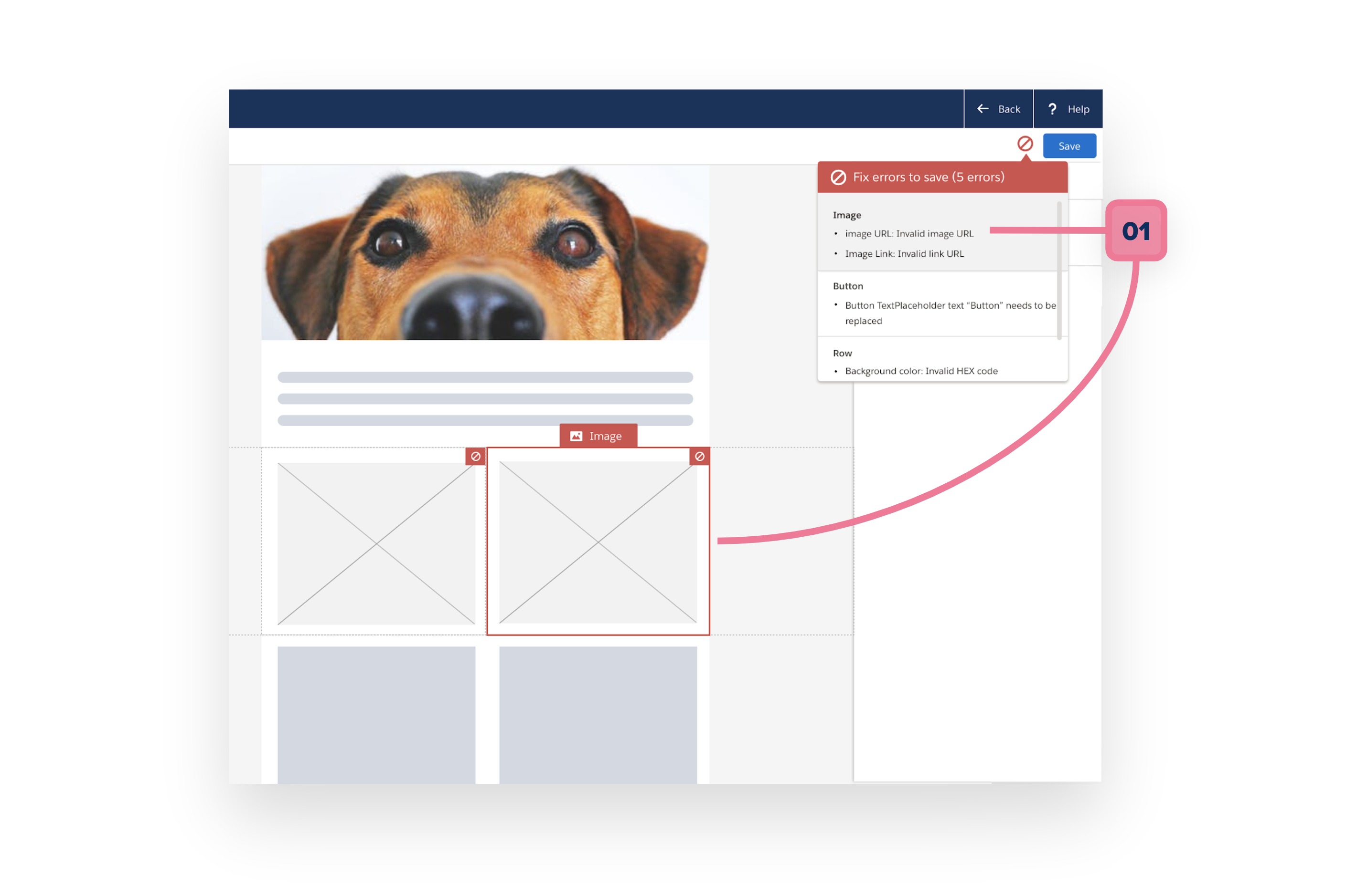
An error or warning state that elegantly informs user about an invalid entry in 1 or more fields and if needed, renders in it’s last successful state. The specs used SLDS tokens and components:
- Label and outline with color $color-background-error or $color-background-warning for error and warnings respectively
- An error or warning indicator (with error icon in $color-gray-1 and warning icon in $color-gray-12) that persists
- An optional popover that lists each invalid entry for that component
Discoverable
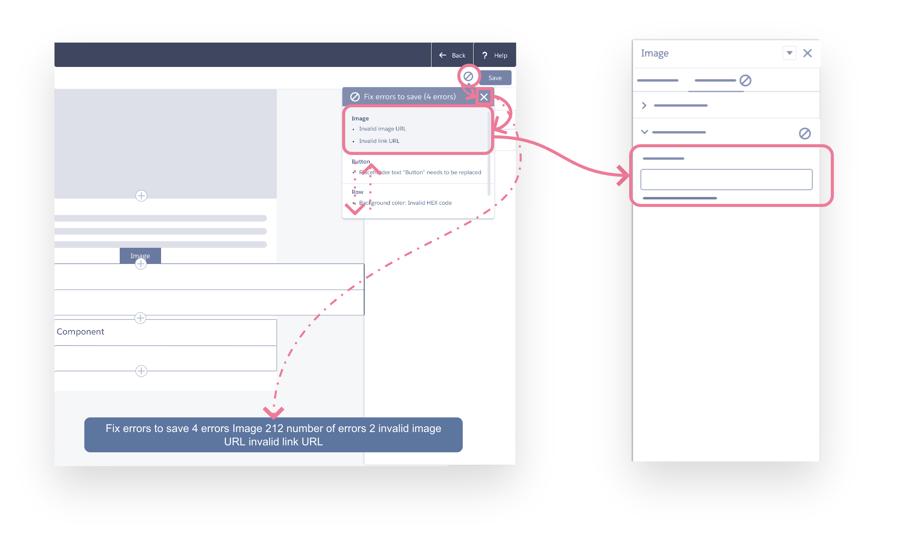
Property Panel Error/Warning Trail
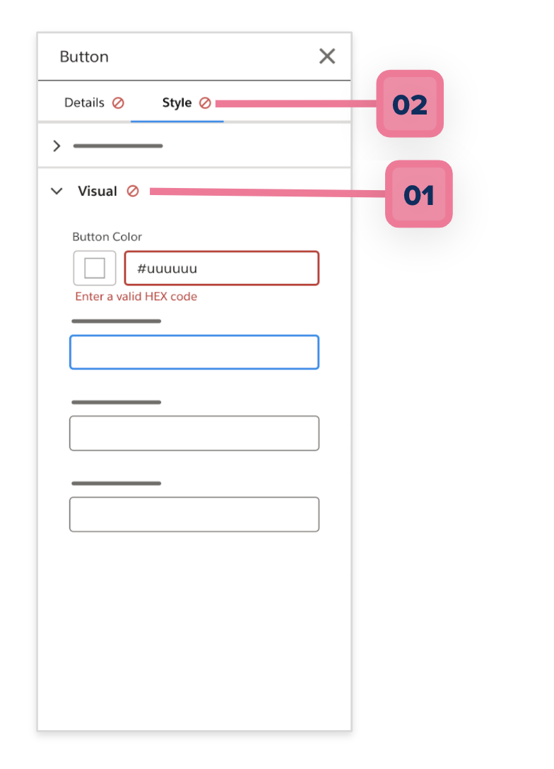
A validation pattern that helps user find the invalid property editors in the panel using a trail of icons:
- Display error or warning icon in accordion header if a field within that accordion is invalid
- Display error or warning icon to the right of tab text if a field within that tab is invalid
Informative & Actionable
Explorations
I wanted to push the solution further by making the pattern more actionable by listing out all invalid property editors that was clickable to helped users get to the problem immediately.
Error & Warning Popover
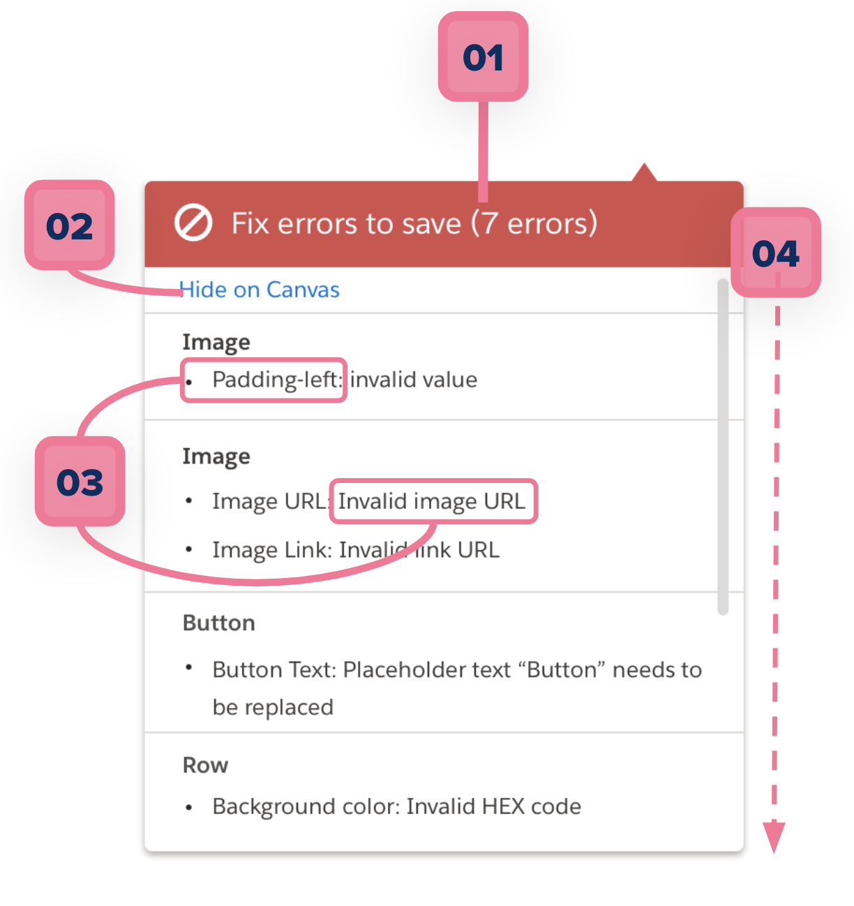
An error/warning popover that gives a holistic view of all invalid components that helps user troubleshoot even if said components are out of view:
- Popover header that summarizes list of errors or warnings
- Ability to temporarily dismiss icons on canvas (nice-to-have)
- Structure of a list item: Name of property field: error message (all rolled up under name of parent component)
- Max height of popover
Popover Interaction
An error popover that gives a holistic view of all invalid components that helps user troubleshoot even if said components are out of view:
- Selecting a component listed in the popover selects that component
Concluding Thoughts
From this project I learnt a lot about designing for accessibility and the importance of making your designs accessbile to all users.
